Friday, May 30, 2008
Tuesday, May 27, 2008
Final Project - Preliminary Critique THIS FRIDAY!
For class this Friday bring at least one full color printout (8.5" x 11" or larger) of your final project illustrations.
By now you should have made significant progress on all three concept designs. At least one of the designs should be complete or near completion.
The class will be providing feedback on your designs that should be incorporated and/or defended before your final critique. If someone gives you feedback that you do not feel is worth incorporating you will be expected to defend your choice during the final critique.
ALSO - There will be a quiz this week where you will be expected to generate specific shapes and effects using Adobe Illustrator CS3. Be prepared and on time.
See you in class,
Dan Mascari
Smoke Stack

This is a logo for a fictional steak house, the colors were carefully chosen to fit the mood for eatery settings and to easily be viewed from afar. The added shapes are there to add depth and life to the individual smoke stacks while still providing enough information for you to still recognize what they are.
I took the liberty of editing the text for both the logo and the slogan from comments I had received during critique making it a more effective and presentable logo design a client would accept.
I welcome harsh critiques to improve this project and many others in the future.
-Kel Goodrich
Friday, May 23, 2008
Culprit Corporation logo design


These are Will Mullady's project 3 logo designs. The name is one I came up with on my own and will possibly use for my portfolio site. I like the idea of mixing two things that are often seen as polar opposites and although i know this name may turn off some, I feel that the types of companies I would like to align myself with will appreciate the sarcasm and edginess of what I'm trying to do. I also like the tag line but there is a good chance I'm the only one who thinks I'm clever.
H. Flynn - Logo Design

Mail is the name of a fictitious skateboard company. The name was created with my nephew Liam in mind. Liam is 10 years old and wants a skateboard design of his own. We have been trying to come up with a name he liked and on the same day we both thought that his name backwards is mail. It just seemed right!
PHP Logo - Michael Blasdel

My logo is a redesign for the PHP group. They have been using an outdated and highly pixilated logo since their conception. I maintained their coloring and tagline and reworked the rest.
The logo uses a traced elephant as the core icon of the logo, with stylized text for the title. The majority of the logo is contained within a block design element combining the two parts, but allowing for easy deconstruction and reworking. The elephant was used in early concepts to distinguish PHP, and was originally inside joke among the developers. By bringing that part of the heritage of PHP back into the logo I feel it has more identity than the purely textual logo currently in use.
-Michael Blasdel
Drea D Logo Illustration

This is my friends record label. Since it is a Jamaican label, most of (all of) their art includes the Rasta colors and a Lion of Judah. I have found that a lot of this type of art can sometimes look crowded and messy, so I tried to make a new logo for them that was more clean looking. I wanted the logo to still look somewhat like a stencil and have the traditional Rasta look, yet also be modern.
Thursday, May 22, 2008
K. Goodrich Object illustration

My inspiration mostly comes from some of my favorite vector art and a mixture of graffiti. I incorperated both of these into my design by using thick bold lines and simple shapes. I chose all hot colors for the object and figure, but a mixture of colors for the sound waves in the background to balance it all out.
Wednesday, May 21, 2008
Wayne - Airline Logo™
Monday, May 19, 2008
Neubauer

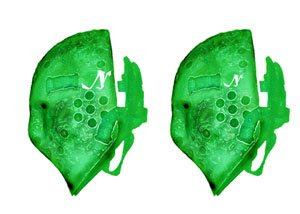
I used my backgound of painting and drawing style of shapes to form this mask, using multi layers, different color overlays and changes the opacity levels. the reason i choose green as the color, its an aged look and feel to the old style of hockey mask. i wanted people to think about the object when viewing it.
Friday, May 16, 2008
Initials+Can


Initials is a combination of a "BL", but i tried to bring across a feeling of fluid movement with the two letters. Where the letters combine, i tired to give some use to negative space.
The can was drawn from direct observation, scanned and illustrated. I used the gradient mesh to limited effect, i need more time with it.
Thursday, May 15, 2008
Project 2
Illustration is not on my list of top things that I love to do. I wish it was! My idea was a meat cleaver with my name dripping off of it in blood. Then that idea morphed into what we have now, which is a lot less morbid! I would like to make the graffiti look more like a sick graf piece and when I learn this program more it will! Or I can just draw that....


Friday, May 9, 2008
H. Flynn - Project 2
project 2


This is Will Mullady's 2nd project. I didn't do alot of tweaking to my initial combinations mostly just merged ojects or pulled a few points to make them connect. The object illustrations I had alot of fun with but didn't want to portray too much realism i like the hard graphical edge. A side note I personally like the urinal better but realised it's not really a household item.
Friday, May 2, 2008
Thursday, May 1, 2008
Subscribe to:
Comments (Atom)


.jpg)


.jpg)
pdf.jpg)


