Monday, March 23, 2009

Motorcycle Tanks - Final


Product Illustration: Motorcycle Tank

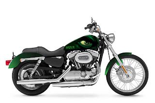
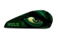
Using three Superheroes from the Marvel Comics and choosing a placement of their faces. 
Spiderman latched onto a building in the big city and fully illustrated using Illustrator and Photoshop.
Ironman with a more comic book feel using mostly all Illustrator. 
The HULK is a close up of his face using brush strokes, overlays, and blending modes to illustrate is piece using Illustrator. 

The motorcycle showing how the illustrations would be utilized. 


This project was done for the cd cover. I redid a Korn cover and utilized the rabbit and the child that were in the previous work of art but added my own twist. This was done in Photoshop with a combination of painting and digital manipulation that is seen in the walls and parental advisory poster. The heads in the jars were copied and pasted but put at different angles so they were a little different.
This was the project done for the text project. The text I made was my initials RML and were done in a greek style typeface to reflect the greek undertones in the painting. This project was done in Photoshop and was sketched out then layers of painted in areas built up. I also used a Wacom tablet to create this.

Book Four

The ships, castle, moons, side of the foresty hill, waves, and crests were all digitally added in. Before the hillside was digitally redone there were houses in the side of it and roads. I copied sections and place them over with erasing parts out to help it fit in and look natural. I painted in atmospheric conditions and used the filter gaussian blur to make them appear more realistic. The typeface used here is Captain Kidd's.

Book Three

The children were added in with shadows in underneath to give them weight in this world where they are chasing flying whales. The field is added in as well as the right mountain to better balance the composition. I painted in highlights on the field and mountains. The typeface is Castgate.

Book Two

The three moons were added in and a low opacity erase was used to help set them into the picture. I also used the Burn and Dodge tool to lowlight and highlight certain areas. The spaceship and reflections were put in as well at a 40 percent opacity and altered. The typeface used is Trogladyte Bold.

Book One

This was done in Photoshop in the style of matte painting. The city is composed of at least four different images of cities. I painted in atmospheric conditions and edited the color settings a lot to have everything unify together. I used the transform tool to put the image onto the book cover. The typeface used is Requiem.

Final

For my Final I chose to make t-shirt designs.  My theme is shapes.  I would sketch designs that were made up of shapes and that I would be able to create on the computer. I wanted to lean away from using Photoshop so the three of these shirts are done in Illustrator only.  I chose these designs because they are some of the types and colors that I would buy and wear.

Final Project - Skimboards

I decided to do skimboards for my final project.  I skimboard myself and I thought it would be fun to create boards marketed toward women.  Everything was done in illustrator from scratch using mostly the pen tool and playing around with color.  Each board has a design on the side that curves in to lead your eye around the board.  I choose to use skulls with fun and friendly scenes to juxtapose the two feelings.  Skimboarding represents this juxtaposition in a way because it is a lot of fun, but can be very dangerous :)  I feel like I've come a long way since the beginning of this quarter and I feel a lot more comfortable using illustrator.

Here are three separate illustrations created all in illustrator. Each character is from their own Castlevania game on the Nintendo DS

Marvel Shoe Designs

For this project, I chose to design skate shoes featuring Marvel Comics characters. The three characters I chose were Spider-Man, Wolverine, and the Incredible Hulk. I wanted to create Marvel themed shoes that would actually be able to wear without being made fun of.

I wanted to keep the designs simple, while still maintaining the look, feel, and characteristics of the character the shoe is based on.

final, Valorie Myer


For my final project I choose to go back to the album project and finish a concept I wanted to do with the band boston. They mostly have a space theme so I went with that and decided instead of albums I would do posters. The hardest part was creating the spaceship, I used the shape tool and pen tool mostly. Each poster  had space themes and incorporated my spaceships in them. I used photoshop and different tools in the effects bar to create the space, moon and stars. If I could go back and work on it more I would attempt to make it look more realistic and add more detail.

Final Project - Product Illustration

Ok, so here is my final project which consist of 3 surfboards each one designed in Illustrator using the pen, line, and swirl tool for the most part. Then, I took them into Photoshop and added the background of the beach from one of my vacations. Well, I hope you like it! Have a great next term!!!


~Cece Wood 


This is my three different designs that incorporate the same theme; the Virgin Islands Flag. I am from the VI so i wanted to incorporate my culture in a shoe. There are not that many articles of clothing that portray the Virgin Islands, so I wanted to do one of my own on a customized shoe.

Final Project :) - Laptop Skins


These are my three product illustrations. I decided to create a set of laptop skins inspired by the non-profit organization To Write Love On Her Arms. The three skins all have a distinct saying on each one; "Remember The Stars", "Love Is The Movement", "Wake Up! You're Alive, We're On Your Side". TWLOHA uses the last two regularly in a lot of their promotional ads, t-shirt designs, etc. "Remember The Stars" was a saying that I thought up based on a quote from the story that started this organization. Overall, I wanted a simple design focused on each skin, with an excerpt from the story faded out in the background, and the TWLOHA logo somewhere on it. I personally love these and want to print out the "Wake Up!" one for my laptop.

It's been a fun class. :) Hope you all like my final!

Monday, March 2, 2009

Karate Poster

Group members: Nick and Jamie
We focused on recreating the logo and making the membership the focus. This logo has a bold statement, is more memorable and fits with the context. The whole poster and all elements were created in Illustrator, except for the cyclone star in the bottom right hand corner (modified in Photoshop). The dragon has a gradient effect with the company colors of red, yellow and black.

Valorie myer and Ashton Avedisian

We decided to base our main image around a chinese symbol. To create the symbol we used pictures of people doing karate and used the threshold tool in photoshop to create them white.  We then added them to illustrator, changed their sizes and then used the brush tool around the figures. We then added the name of the school around the image. We put all the information and logo at the bottom. We were going for clean and a creative look.

This poster was made by Rachel Carroll, Cece Wood, and Tera McCarthy.  We decided to use Bruce Lee's image in a Scarface-esque type of poster.  The effect was created by bringing in Bruce Lee's image into photoshop and using cutout, lasso tool and magic wand tool to make certain sections black and white.  The karate flower in the background was created entirely in illustrator as well as the karate silhouette guys.  We played with the opacity and added some drop shadows, respectively.  We kept the text fairly clean and unaltered, except for the color; we used the papyrus typeface.  We thought it would be fun to add Mr. Miyagi to give the poster a whimsical feel.  Overall, we are very happy to how this poster turned out.

Karate Poster :)

I just wanted to create a bright, eye-catching, really bold poster for this. I decided not to use the logo as-is and took the dragon and integrated it into the background, as well as using some grunge vector textures I've had in a folder unused for a while.. I was kinda going for an underground kinda feel.. hopefully it works. I'm happy with it, at least..

Sunday, March 1, 2009

valorie myer object and initial

To create the sunglasses I used the pen tool almost completely to trace my original picture. Then I used the fill tool to color my sunglasses and the gradient tool to make the lens look shaded. Lastly I added my initials to the side of the sunglasses as a logo.
To make my initials I used a serif for the v and a sans serif for the m. I took off the left side of the m and extended the twirl of the v. Then I used the path finder tool to connect them together.