Here is a link to a design by a firm called information architects correlating web traffic to differnet locations on the Tokyo subway map.
http://informationarchitects.jp/web-trend-map-4-final-beta/
click here to jump
Wednesday, August 26, 2009
Monday, August 24, 2009
Jessica Pecoraro - Initials Object
This was definately the most challenging so far, the initials were fun to draw, but the surfboards seemed almost impossible. For the initials JP, I mostly used the pen or pencil tool and played around with the brushes. For the surfboard I used the pen too and the bucket, as well as the sprayer. I feel the initials look pretty cool and the surfboards are just okay.

Jessica Pecoraro - Anchor
Jessica Pecoraro
Monday, August 17, 2009

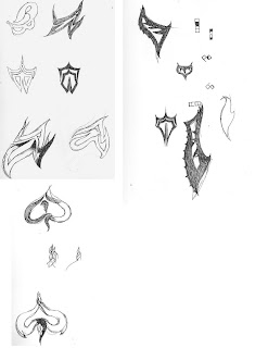
In my process I tried a bunch of different versions of my initials. I liked the more organic looking ones so thats what I went with. I used the pen tool in Illustrator to create one side of my initials. I then copied that side and reflected it to make the other side. I scaled that side down a little bit then added both sides to form one shape. I tried to make it look like a spade and I think I did an alright job at that. Since it looked like a spade I figured I'd use a deck of cards as my object. I basically used a bunch of shapes stacked on top of each other. I used the pen tool to draw some things as well.
project 2


I was having trouble deciding on an image to choose as my illustration so I did symbol and an object and combined them. I took a peace symbol and a mask and tried to make the symbol appear in the negative space of the two masks. I think this illustration could be used in tee shirt design and poster design with some tweeks and type.
Project 2 Baileigh Armes
 My initials are 'B' and 'A'. I tried different types of type faces to see what kind of design I could make. Eventually, I decided to use the paint brush and make the design my own. I used the pencil tool to make the headphones and then used fill to color them in. I chose headphones because I would love to design a pair of my own one day. Maybe this design will be seen again. :)
Thursday, August 13, 2009
Kari Single- Proj 2


Project 2- Initials and Object Composition
I chose a Sunflower for my object because of their "sun-like" appearance and the positive characteristics that the flower represents. I used the pen tool to create each individual petal with its shadows to give the object the appearance of a impressionistic painting. The seeds were drawn and made into a symbol and then spray painted to achieve numerous seeds. The leaves also display my initials which are a "K" and an "S".
The second initials on the top represent the simplicity in life I like to achieve in my everyday duties.
Wednesday, August 5, 2009
Adam Bentley Project 1

I chose scissors as my object. The first two I just put a pattern behind the scissors. The first pattern I went for was mostly straight lines and the second one I went for the wavy look. On the last one I tried capturing the reflection of the metal on the scissors. It was a challenge but I thought I did an alright job of catching the reflection. I used mostly the pen tool for everything plus some circles for some things.I'm happy with all of them but my favorite is the last one.
Nikki Chiavuzzi Project1
 I wanted to do a camping axe because I liked the idea of taking some hostel and playing with it in a black and white cartoon effect. After playing around (the outer two axes) I decided to finally add some groteque details. I added texture, made more parts of the axe black, and drew in the blood. I'm very pleased with the final (center), though it needs some touch ups.
Project 1
Baileigh Armes Project1
PROJ 1
Post your first project
Students you need to post web friendly version of your first project along with a description of your process, technique and inspiration.
Subscribe to:
Comments (Atom)


