


 For my final project I chose to do custom Japanese themed paint jobs for my car. I chose fish and the great wave for the first one I did. This one could still use a lot of work in the little details. As I went along I got better at the techniques. The second one I chose to do a Japanese red dragon representing storms and wind which is why i chose the dark grey colors. The dragon could still use some detail in the face and scales but overall im happy with it. And the last one is the cherry blossoms. This one I believe came out the best and is also my favorite.
 My main goal for this project was to focus on the object of a hookah and try to make the metal look realistic. I broke it down into shapes and used solid fills of black, greys and whites. To create the smoke in the background i messed with different shapes on different layers and changed the opacity. Then I warped them with the twirl tool. I chose the colors so that you could tell it was smoke but was more exciting.


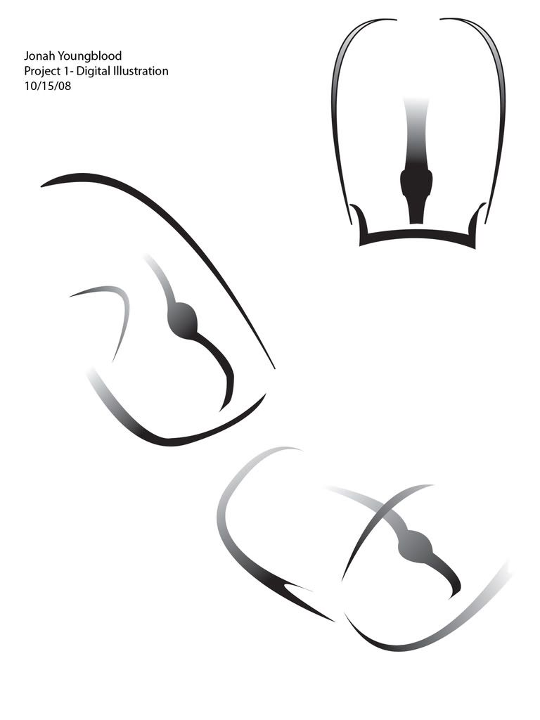
 For Project 1 I used a wine glass to simplify in Illustrator. What I was trying to do was to give the feel of a wine glass but take so of the elements out. I did not want to give it a a look like more vector images have, like the straight edge look. I tried to give it a look that looked more as a photograph. Another thing that I was trying to develop was giving the images shading as if I was using levels of grey in it as well. I did this by making rigid shapes that ranged from little to big. this allowed the image to have depth in it.
 This is my Corporate Identity for Amazon Plumbing Services. I used a frog that is native to the Amazon Rainforest and chose it because it looked "fat and grumpy" which is what most people think about when they think of plumbers. Who wouldn't be grumpy if it was their job to unclog toilets?


 This is my final object/initial composition. For my object, I used a baby bottle. In a sense, it signifies the pain from growing into the adult world, leaving your childhood behind. To the right of my object, my initials float above the flattened pool of red that is also copied and flipped below it. My initials are a play on negative space, contrasting the dark background. I feel that both these compositions are strong enough to be presented on their own. I also feel that they can be represented together as a unifying piece.
 In executing this project I utilized typography techniques, the pathfinder and pen tools, worked with a gradient within a greyscale color palate. I took Dan's advice to increase the transparency of the background to allow for the monogram to stand out on its own - looks much better!
 I decided to arrange my initials so that the letters are insinuated. I had a more complex version of the letter 's,' but decided to keep it simple with three shapes. The letter T is an enlarged font that I divided. Had I spent more time, I would have added more detail to the padlock. I didn't want the letters to look flat on the padlock, so I gave them an engraved effect.


