 For the first project I chose a banana because of all the fruits, they seem to have the most personality. Also, using an organic object made it easier to create the image because there weren't a lot of sharp edges. I am new to Illustrator and not quite comfortable using all the tools yet. I made these images by hand using microns then scanned them into Illustrator and manipulated them in the program. My favorite is the rotten banana.
Monday, January 26, 2009
Project1
 For the first project I chose a banana because of all the fruits, they seem to have the most personality. Also, using an organic object made it easier to create the image because there weren't a lot of sharp edges. I am new to Illustrator and not quite comfortable using all the tools yet. I made these images by hand using microns then scanned them into Illustrator and manipulated them in the program. My favorite is the rotten banana.
Lamp Illustration
Project 1
Illustration-Toothbrush
Jonthan Otte's Toothbrush
Starting with an outline of a toothbrush I was able to see the shape of the basic object. Making a copy of the first toothbrush I then filled in the negative space around the toothbrush to form the second toothbrush shape. Taking the inverse of the negative space the form of the toothbrush was more easily seen in the third where I added the bristles to identify the object better.

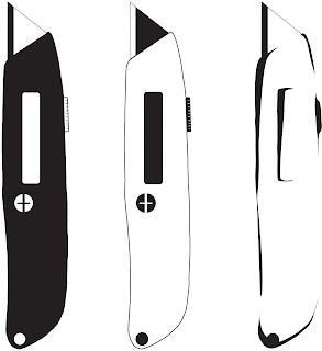
 I chose to illustrate razor blades for the first project. The first two illustrations, moving from left to right, were created using mostly geometric shapes ( circles, squares, rectangles) via the shape tool in Illustrator. I also changed the colors from black to white in the first two images.
 The last image was created using the pen and pencil tools in Illustrator. I also used a Wacom tablet to draw the organic shapes that make up the final illustration. The last illustration was my favorite.
-Nick
Project One-Vector

Project one asked to pick an object, any object, and stylize it three different ways using the vector technique. I wanted to pick an object that actually meant something to me, allowing inspiration to help guide my way. I chose my pointe shoes. I did three drastically different vectors. The first one I did I used black in place of any lighting. The second one was reversed. The third one, i did a minimal approach, allowing the eye to fill in anything that may be missing. I also used thinner lines, keeping more of a minimal look, as opposed to the chunky look in the first two. My favorite is most likely the second one. It was hard for me to decide whether i should keep the leg out or not. I am content with my choice.
Image Translation

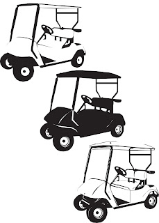
I chose to use a golf cart for the translation project. It was a relatively simple project and I enjoyed doing it. Basically, I imported my image into Illustrator, lowered the opacity, and locked it. This made it easier to see what I was doing while "tracing" the image. I mostly used the pen and pencil tool with the auto fill setting enabled. After I finished the first, less complicated, illustration, I then inversed the colors and added a little detail in the larger blocks of black. After that, I added more detail to the original drawing and finished up the entire project under an hour. The project was fun and I look forward to getting into more advanced assignments.
Stapler

When approaching this project, I attempted to minimize the amount of detail while still maintaining enough visual information to still recognize the object as a stapler.
The simplification process for this particular object was more difficult than I initially anticipated, partially due to the fact that many of the lines I wanted to minimize were vital to the object composition.
In summation, I probably would have left more of the details in to make the stapler more recognizable. Oh well, there's always next time.
: )
Project 1- Mug & Spoon
Working through my process with multiple variations...

My favorite out of the group...


My favorite out of the group...

Using Illustrator I took my image from a photograph and imported the image. Then I used many of the tools in illustrator and multiple layers to create many variations of the mug and spoon. I did 8 variations to work my way through the negative and positive space and to come up with a minimalistic creation of the mug and spoon.
My goal was to come up with a simplistic logo of a unique mug & spoon.
Project 1 - Image Sublimation


This image of a lamp was produced first by outlining areas of lighting from several different photos of lamps and different shades of lighting. Once I was done hand rendering it, I scanned it into photoshop, cleaned up the ink spots and filled in particular outlined areas to give it different feel. Almost causing it to look like an optical illusion.
~Cece Wood
Project 1 - Design Translation

In this project, we were told to take a simple object and translate it into an illustration. This project basically reminded me of Concept Design, but in 2 weeks instead of 11. Since I am not very good with tracing photographs or techniques of that nature, I freehanded my initial illustrations using paper, pencil, and ink. After finishing these, I scanned them into the computer and imported them into Illustrator. Using these as a guide, I created the illustration the only way I've known - tracing using the pen tool. My edges are rough and not very smoothed out, but this was my first time really illustrating something with this program, so I had some difficulty.
My goal for this project was to come out of it with a better feel for Illustrator, since my past experience with it was just type-oriented, not so much in a graphical sense. After this project was all said and done, I feel like I acquired a better feel for the program and am ready to take on the next project. :)
Until next time..
Welcome to Digital Illustration Winter 2009
If you are a student in the class you should have received an email invitation to post as a blog author.
If you have not received your email invitation please contact me at dmascari@aii.edu
It is your responsibility to post your work with a summary/description for each project. You should write in a professional manner and please leave constructive comments for your classmates work as you see fit.
Make sure that the work is saved in a web friendly version (jpg, gif, png). If the image is not appearing first check to make sure that it is in RGB mode and not CMYK.
Project One - design translation
Please post a web friendly version (.jpg, .gif, .pdf) of your design translation project. Write up a short summary of your project, outlining the techniques you used, your goals for the project and what knowledge you gained.
Labels:
design translation,
Digital Illustration,
Project 1
Subscribe to:
Posts (Atom)


