Monday, September 28, 2009

Morales, Joshua: Final Project


              For my final project I decided to do three types different of katanas. I used three spiritua; animals and seperated the blade into 8 separate parts: Blade, Sheath, Back, Middle, Tip, Sword Guard, Butt, and tip of sheath.I did a detailed amount of work on each blade applying textures made from scratch including, carbon fiber, brushed metal, and gold. Also I made the Sword guards from scratch each with a unique look to them.

Thursday, September 24, 2009

Project 4 Nico, Cervantes


My product illustration was credit/ debit cards. I wanted to create a debit card design that was not the conventional two tone color design. My target audience for this project was the rocker/ bmx/skater audience. I wanted to try and create something that would be enjoyed universally so I decided to go with a simple black white and grey color scheme. I'm very happy with the outcome and time I put into making this illustration.

Wednesday, September 23, 2009

Final Project- Jessica Pecoraro


I chose to do wine bottle label designs for my final project. I work in a restaurant and wine knowledge for me is a must, so I was able to research labels at work, and do a lot online. I found the designs that caught my eye the most were the simple ones. So, thats what I decided to do. I decided to go for a theme with the three different Z's. Zeal, Zest, and Zing... Which are all three words that could very well describe a wine. As far as the actual illustration, I illustrated the wine bottle myself, which took the most time. I chose an image from google and then used the pen tool, gradient tool, and mesh tool to help me with making it look more realistic. Then copied it three times. I then designed the labels and placed them on the bottles. Overall I feel I did a pretty decent job and feel that I have come a long way since the beginning of the quarter.


Adam Bentley : Final Digital Illustration


I play disc golf alot so it was only natural for me to design my own discs. I was trying to go for a little grunge look but also just wanted to do my own thing. I tried to keep most of the design symetrical since it is on a round object. I used live trace for some of the pictures like the skull and Bob Marley and the trees behind him. I also used the pen tool to draw out some things like the little tear drop looking things on the blue disc. I was going to add a face to the green one to make it fit in more because it does seem a little out of place but I couldn't figure out which face to put on there. All in all I'm happy with the outcome of the product and I'm currently trying to find a place that can print these directly on my discs so I can truly start to make my own discs.


Product Illustration

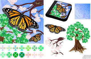
I've created a set of images to go onto the cover of CD/DVD books for storing discs. So I chose three natural images, and used discs for the circular elements in the images.

Butterfly: I had originally intended to create a bonsai tree for this image with cherry blossoms in the background, but the tiny bonsai tree just kept looking like an ordinary tree that was out of proportion. So I decided to focus the image on a butterfly, and used the bonsai tree as an ordinary tree in the background.

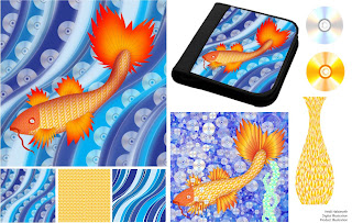
Koi: I had tried two versions of this koi, using the same koi outline I had created. But I almost entirely remade it. The gradient on the first one (lower center right) wasn't even, the scales, which were created from a flat pattern of overlaying orange tinted discs, looked flat, and the background wasn't impressing me. The "vase" image is what I placed in the background of the final koi body, warped so its appearance would be less flat, and I made the final gradients in Photoshop, which came out better.

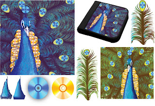
Peacock: I created the feathers first, which looked like spikes until I used the warp tool on it. I've included the base image of the body created with the mesh tool, and the texture that went overtop using a stylized brush (both in the lower lefthand corner). Once assembled, I found I wasn't very pleased with over abudance of the green and brown in the feathers (lower righthand corner) so I adjusted the levels in Photoshop for my final image.


Illustrated Instructions


I first created this kind of display (the one in the photograph in the lower right hand corner) trying to preserve dried flowers I'd had in a box for years. I came up with how to make it just finding random, unused stuff in my home. So I made the second one in the lefthand photo to figure out the right way for someone else to make this considering why they would want to make this kind of display. There is some use of the 3D toolin Illustrator, which was rather difficult to achieve the intended appearance.

Initials and Object


Initials: Since my initials are HH I got the idea to do a play on reflection, which is why each version has both initials mirroring each other with little difference. The first one has my initials in a set of scrolls, and the second is an exploration in geometry.
Object: This object is a dragonfly pin that I have. A great deal of the slight variations in color and reflections are just dots created with the paintbrush in Illustrator, and blurred in Photoshop to give it a smoother, more realistic appearance.